TOPIC
Cinematic Techniques that Amplify Terror in ‘The Nun 2’
The haunting corridors of the abbey return with an even more chilling presence in “The Nun 2.” As audiences flock to theaters, they brace themselves for a spine-tingling journey into darkness. This sequel doesn’t just rely on jump scares; it employs a masterful blend of cinematic techniques that elevate its terror to new heights. In this post, we’ll delve into how these elements create an unforgettable viewing experience and amplify the fear factor that fans have come to love. Prepare yourself for insights into the art behind one of horror’s most talked-about films!
The Importance of Cinematic Techniques in Horror
Cinematic techniques play a crucial role in the horror genre. They are the tools that filmmakers use to evoke fear and suspense, transforming ordinary moments into nail-biting experiences.
Lighting sets the mood and creates an unsettling atmosphere. Shadows can hide lurking dangers, while harsh light reveals terrifying truths. Each flicker or dimming of lights sends chills down your spine.
Sound is another vital element. From eerie whispers to sudden loud bursts, sound design enhances tension. The right score can linger in your mind long after the credits roll.
Camera angles also contribute significantly. A low angle shot may make a character appear more menacing, while close-ups can capture raw emotion and terror on actors’ faces.
Editing shapes pacing and timing, manipulating how viewers anticipate scares. Every cut and transition builds unease, maintaining suspense until the very last moment.
Key Cinematic Techniques Used in ‘The Nun 2’
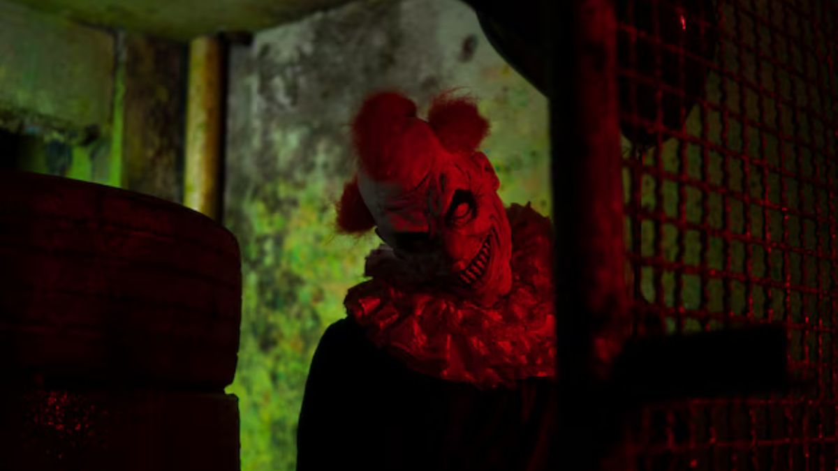
‘The Nun 2’ employs a range of cinematic techniques that significantly heighten the horror experience. One standout method is the use of atmospheric lighting. Shadows loom, creating an ominous feeling that keeps viewers on edge.
Color grading plays a crucial role as well. The film utilizes muted tones interspersed with bursts of sickly greens and reds to evoke unease. This visual approach enhances the eerie ambience throughout.
Camera angles are strategically chosen to elicit discomfort. Low-angle shots make characters appear vulnerable, while high angles can instill a sense of dread about what lurks above them.
Movement is equally important; slow pans build tension, allowing dread to simmer before it erupts into chaos. Together, these elements craft an unsettling atmosphere that immerses audiences in its terrifying narrative.
Lighting and Color Grading
Lighting plays a pivotal role in shaping the atmosphere of ‘The Nun 2.’ The filmmakers expertly manipulate shadows to create an oppressive sense of dread. Dark corners and flickering lights heighten anxiety, making viewers anticipate something lurking just out of sight.
Color grading further enhances this terror. A muted palette dominates the film, underscoring themes of despair and hopelessness. Deep blues and sickly greens evoke unease, while stark whites amplify moments of shock.
Strategic use of light sources adds depth to scenes. Candlelight flickers ominously as characters traverse eerie hallways. Each beam reveals hidden threats, amplifying tension with every step they take.
This meticulous attention to lighting and color transforms mundane settings into chilling landscapes that linger long after viewing.
Sound Design and Music
Sound design and music play a pivotal role in crafting the atmosphere of “The Nun 2.” The eerie audio landscape heightens tension, keeping audiences on edge. Creepy whispers and unsettling ambient sounds create an immersive experience that transcends visual storytelling.
Every creak, every distant echo is meticulously crafted to draw viewers into the chilling world of Valak. Silence becomes a weapon; moments of quiet amplify fear just before a jump scare strikes.
The score complements these elements brilliantly. With haunting melodies and sudden crescendos, it evokes dread while guiding emotional responses throughout pivotal scenes.
Together, sound design and music intertwine seamlessly with visuals, enhancing each terrifying moment. This synergy not only captivates but also leaves its mark long after the credits roll.
Camera Angles and Movement
Camera angles and movement play a crucial role in evoking fear in ‘The Nun 2’. The filmmakers expertly utilize low-angle shots to emphasize the towering presence of evil. This technique makes the viewer feel small, amplifying the sense of dread.
Rapid camera movements enhance tension, creating an unsettling experience. Sudden shifts from wide shots to tight close-ups can catch audiences off guard. It’s as if the very walls are closing in on characters, mirroring their escalating panic.
Moreover, handheld camera work injects a raw authenticity into key scenes. This shaky perspective immerses viewers in chaotic moments where every creak or whisper heightens anxiety.
Each angle tells a story and each movement builds suspense. Together, they craft an atmosphere that grips you tightly until the final frame fades away into darkness.
Editing Techniques
Editing techniques play a crucial role in shaping the narrative of ‘The Nun 2.’ The film employs jump cuts to create disorientation. This technique pulls viewers abruptly from one scene to another, heightening tension and surprise.
Transitions are also masterfully crafted. The seamless flow between scenes can evoke unease or anticipation. Sudden shifts leave audiences on edge, unsure of what might come next.
Pacing is key in horror storytelling. Quick cuts during intense moments amplify fear, while longer takes build suspense. This contrast keeps viewers engaged throughout the film.
Moreover, the use of slow-motion enhances critical moments, allowing chilling visuals to sink in deeper. Each frame invites reflection while simultaneously stoking anxiety.
These editing choices work together seamlessly to elevate ‘The Nun 2’ into a realm where every heartbeat matters and every shadow looms larger than life.
How These Techniques Amplify Terror in ‘The Nun 2’
The chilling atmosphere in ‘The Nun 2’ thrives on its masterful cinematic techniques. Each element works together to pull the audience into a world of dread and unease.
Lighting plays a pivotal role, casting shadows that seem alive with malevolence. Dimly lit scenes evoke claustrophobia, making viewers feel trapped alongside the characters. Sudden bursts of light often reveal horrors lurking just out of sight.
Sound design further heightens tension. Eerie whispers and sudden jolts create an unsettling backdrop, ensuring every creak in the silence feels significant. The haunting score underscores moments of suspense, amplifying feelings of fear before crucial scares.
Camera angles amplify disorientation as well. Low shots make characters appear vulnerable against towering threats while quick cuts keep viewers on edge. This chaotic movement mirrors the internal turmoil experienced by those facing their darkest fears, rendering each scene visceral and unforgettable.
Comparison to the First Film
The Nun 2 builds upon the foundation laid by its predecessor. While the first film introduced audiences to the eerie world of Valak, this sequel dives deeper into character development and plot intricacies.
Visually, The Nun 2 amplifies what was already unsettling in the original. The cinematography is more refined, enhancing suspense through intricate shot compositions. Viewers are treated to a richer palette that accentuates dread.
Sound design also takes center stage. Unlike its forerunner, which relied heavily on jump scares, The Nun 2 utilizes ambient sounds and haunting melodies to create an atmosphere of lingering fear.
Character arcs evolve significantly as well. Sister Irene’s journey feels more pronounced in contrast to her earlier portrayal, allowing audiences a deeper emotional connection amidst the terror unfolding around them.
Each element combines seamlessly to elevate horror beyond mere frights found in the first film. This evolution marks The Nun 2 as a standout entry within modern supernatural cinema.
Conclusion
The Nun 2 stands as a testament to the power of cinematic techniques in horror filmmaking. The meticulous attention to lighting and color grading creates an atmosphere thick with dread, while sound design enhances the eerie silence that permeates key scenes. Strategic camera angles and movements draw viewers into a world where every shadow holds potential danger, intensifying the emotional response.
Editing plays its part by crafting tension through pacing and rhythm, allowing suspense to build before delivering shocking moments. Each technique works harmoniously, ensuring that audiences are not merely passive observers but active participants in this chilling narrative.
When compared to the first film, The Nun 2 showcases how evolved cinematic strategies can elevate storytelling within a familiar universe. Fans of horror will appreciate these innovative approaches that keep them on edge and engaged throughout.
With such effective use of these elements, it’s clear why The Nun 2 has become a standout entry in contemporary horror cinema.


Inheriting a home in Fort Worth can create both opportunities and challenges for beneficiaries. The potential financial gain is attractive, but there are also legal, financial, and emotional hurdles to navigate. If you want to sell quickly and avoid unnecessary stress, learning the process is essential. This guide will walk you through practical strategies for selling an inherited Fort Worth property efficiently, with insights about working with a reputable Company That Buys Houses as part of your options. Whether you need to settle an estate promptly or simply wish to avoid managing a vacant property, understanding each step in the sale can help you make an informed choice. From legal requirements to selling options like cash buyers, the goal is a smooth transaction and peace of mind during a potentially stressful time.
When selling an inherited house, you must address legal hurdles, tax implications, documentation, and the property’s condition. By following structured advice and considering all your options, you can protect your financial interests and move on quickly. For many, selling as-is to a reliable buyer relieves much of the burden. Review every step in this guide to avoid common pitfalls and focus on a straightforward path to closing. Securing a trustworthy buyer for inherited properties is possible and can be achieved quickly if you take the right steps from the outset. For further information and guidance on inherited property sales, visit their website at https://www.acompanythatbuyshouses.com/.
Understanding the Probate Process in Texas
Probate is the court-supervised process of transferring property from an estate to its heirs or beneficiaries. In Texas, probate is usually required unless title is transferred through a living trust, right of survivorship, or other legal mechanism. Probate ensures that debts are settled and that assets are distributed properly. If there is a will, the process starts with validating the document in court. Without a will, estate assets are distributed according to state law. Working with an experienced probate attorney can save time and help you avoid procedural errors.
Assessing the Property’s Condition and Value
Before putting an inherited Fort Worth home on the market, assess its structural integrity, outdated features, and overall condition. Hire a licensed appraiser or an experienced real estate agent to determine the home’s fair market value. Ask for a comparative market analysis and, if necessary, an inspection report to understand the potential costs of repairs or upgrades. This information will help you decide whether to invest in updates or sell the property as-is, which is often a faster, easier solution for many heirs.
Exploring Selling Options
Heirs can choose from several selling methods, each with advantages and drawbacks. Listing the property with a real estate agent can bring in top dollar but usually involves repairs, staging, showings, and a lengthy closing process. Selling For Sale by Owner (FSBO) lets you avoid agent commissions, but you must handle marketing, paperwork, and negotiations on your own. If rapid sale and minimal hassle are priorities, selling to a cash buyer is often the preferred choice. Cash buyers purchase homes as-is, usually closing in a week or two, making this option especially suitable for those seeking speed or dealing with distressed properties. Local companies specializing in inherited and distressed homes offer flexible selling solutions, such as no-obligation cash offers and the option to cover closing costs. Working with these buyers can help you avoid the expense and delays of traditional sales channels.
Understanding Tax Implications
When you inherit property, you benefit from a “step-up” in tax basis, which means the IRS values the home as of the date of inheritance rather than its original purchase price. This adjustment usually reduces the capital gains tax liability if you sell soon after inheriting. However, every situation is unique, depending on how long you hold the property and any additional improvements made before selling. Consulting with a qualified tax professional is wise to ensure compliance and prevent costly surprises. More information about capital gains and inherited homes is available at IRS Topic No. 703.
Preparing Necessary Documentation
Be organized from the outset by collecting all important documentation. You will need the deceased’s death certificate, the will and probate documents, the property deed, current tax assessments, and any open mortgage information. These materials help expedite the transaction, especially when you choose a direct cash buyer who can move fast but requires proof of legal standing to sell.
Working with Cash Buyers
Cash buyers simplify and accelerate the sale of inherited homes. After reaching out and providing property information, you will usually receive a no-pressure, cash offer. Once you accept, closing is often completed within days, with the buyer covering most or all closing costs. This approach is ideal when you want to sidestep common delays caused by financing contingencies, repairs, or inspections. Cash buyers typically handle properties as-is, offering relief from the need to invest additional time or money in a house you do not plan to keep.
Frequently Asked Questions
Do I have to complete repairs before listing my inherited property?
No. Most cash buyers purchase properties in their current condition. If you use a real estate agent, you may need to make some repairs for a better listing price, but it is not obligatory.
How soon can I expect to close when selling to a cash buyer?
After accepting an offer, most cash buyers complete the transaction within 7 to 14 days, depending on the complexity of the probate and title processes.
Are there additional costs or hidden commissions with cash buyers?
Reputable cash buyers do not charge commissions and commonly cover all customary closing costs. Review the purchase agreement carefully to confirm terms.
Conclusion
Selling an inherited property in Fort Worth does not have to be overwhelming. By understanding the unique steps involved, especially the probate process, local real estate market, tax implications, and advantages of cash buyers, you can confidently navigate your sale. Gathering key documents early and seeking professional advice will further streamline your experience, ensuring a fast and successful property transfer on your terms.
Tattoos are meant to be permanent expressions of who we are, but sometimes what felt right years ago doesn’t align with who you’ve become today. Whether it’s a name of an ex-partner, a design that no longer represents you, or simply a piece that didn’t age well, there’s no shame in wanting a fresh start. Here are seven clear signs that it might be time to consider removing that old tattoo.
Your Tattoo No Longer Reflects Who You Are
We all evolve as people, and the interests, beliefs, or affiliations we had at twenty might feel completely foreign at forty. That band logo that once meant everything to you might now represent a phase you’ve moved past. Maybe you got inked during a rebellious period, or perhaps your political or spiritual views have shifted significantly.
The beauty of personal growth is that it’s natural and healthy. If you find yourself cringing when you catch a glimpse of your tattoo or constantly making excuses for it, that’s a strong indicator that it’s no longer serving you. Your body art should make you feel confident and authentic, not embarrassed or disconnected from your current self.
It’s Affecting Your Professional Opportunities
While workplace attitudes toward tattoos have become more relaxed in recent years, certain industries and positions still maintain conservative appearance standards. If you’re pursuing a career in law, finance, healthcare, or corporate leadership, visible tattoos might create obstacles you’d rather not navigate.
You might notice that you’re constantly wearing long sleeves in summer or strategically positioning yourself in photos to hide your ink. When your tattoo starts limiting your wardrobe choices or making you feel self-conscious in professional settings, it’s worth considering removal. Your career aspirations shouldn’t be hindered by a decision you made years ago.
The Quality Has Deteriorated Over Time
Even the best tattoos don’t always age gracefully. Sun exposure, weight fluctuations, and the natural aging process can cause ink to fade, blur, or spread. What was once a crisp, vibrant design might now look muddy or distorted.
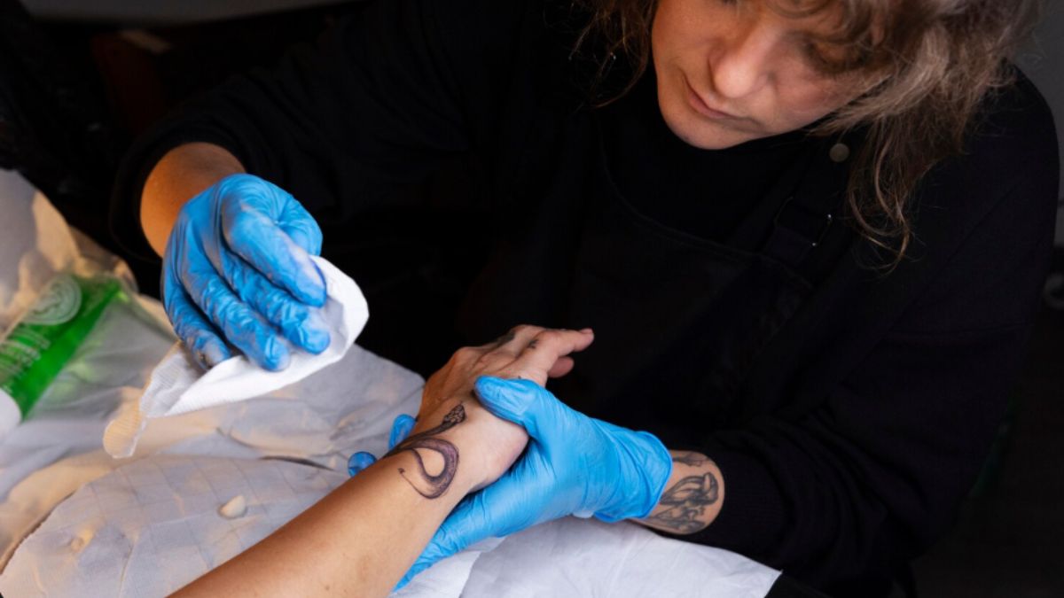
Sometimes the original work wasn’t high quality to begin with, or perhaps it was done by an inexperienced artist. If your tattoo has become an eyesore rather than an artistic statement, removal might be a better option than attempting a cover-up. For those seeking professional help with faded or poorly executed tattoos, researching top-rated tattoo removal in Indianapolis can connect you with experienced specialists who understand how to safely eliminate unwanted ink.
You’re Dealing with a Relationship Reminder
Few things feel quite as awkward as carrying around a permanent reminder of a failed relationship. Whether it’s a partner’s name, matching designs, or something that symbolizes a relationship that’s long over, these tattoos can make moving forward emotionally difficult.
New partners might feel uncomfortable with visible reminders of your past, and you might find yourself constantly explaining the story behind the ink. Removing a relationship tattoo can be an empowering step in closing that chapter and fully embracing your present and future.
The Placement Makes You Self-Conscious
Sometimes the issue isn’t the design itself but where it’s located. That neck tattoo might have seemed edgy at the time, but now it’s the first thing people notice about you. Hand, face, and finger tattoos are particularly difficult to conceal and can draw unwanted attention.
You might feel like your tattoo defines you in social situations or that people make assumptions about your character based solely on visible ink. When your tattoo’s placement consistently makes you uncomfortable or affects how others perceive you, removal becomes a reasonable consideration.
You’re Planning a Major Life Event
Weddings are common catalysts for tattoo removal decisions. Many people want to look their absolute best in photos that will last forever, and that regrettable tattoo might not fit the aesthetic they’re envisioning. Similarly, those entering the public eye through politics, media appearances, or other high-profile roles often reconsider their ink.
These milestone moments offer natural opportunities to reinvent yourself and present the image that best represents who you are today.
You Simply Want a Clean Slate
Sometimes the reason is straightforward: you’re ready for a fresh start. Maybe you’re tired of explaining your tattoos, or perhaps you just prefer how your skin looks without them. Your body is yours to modify as you see fit, and wanting to return to unmarked skin is completely valid.
Moving Forward with Confidence
Deciding to remove a tattoo is a personal choice that deserves careful consideration. If one or more of these signs resonates with you, it might be time to explore your removal options. Modern laser technology has made the process safer and more effective than ever, giving you the opportunity to reclaim your skin and move forward with renewed confidence.
-

 TOPIC9 months ago
Top 5 Features of Googlediqiu You Didn’t Know About
-

 TOPIC1 year ago
Why Large Waterproof Outdoor Rugs Are Essential for All Outdoor Spaces
-

 TOPIC1 year ago
7 Expert Tips For Choosing The Best Basement Renovation Companies
-

 FASHION1 year ago
How to Layer Your White Dress for Cold Weather?
-

 TOPIC10 months ago
Why Greece Katz Martian Has Everyone Talking in 2025
-

 BUSINESS11 months ago
Top 5 Features of Sowix Online That Every User Should Know About
-

 TOPIC11 months ago
Top Features of BetterThisWorld .com You Need to Know About
-

 FINANCE1 year ago
How TraceLoans Can Simplify Your Finances